🎨 How to Build the User Interface in a Canvas App in Power Apps
📅 Published Date: March 2, 2025 ✍ Author: Pranay Reddy Muthyala
📌 Introduction
A well-designed user interface (UI) is critical for creating an intuitive, user-friendly Canvas App in Power Apps. Branding, layout, and responsiveness play a key role in ensuring users can interact efficiently with the app. 💡
In this blog, we’ll cover how to build and refine the UI of a Canvas App, exploring themes, branding, icons, images, personalization, and layout options.
🎨 Using Themes in Power Apps
Power Apps provides prebuilt themes to ensure consistency in app design. Custom themes allow you to apply brand colors and fonts consistently across the app.
🖌️ How to Apply a Theme?
- Select the App object in the Tree View.
- Navigate to Properties → Choose a predefined theme.
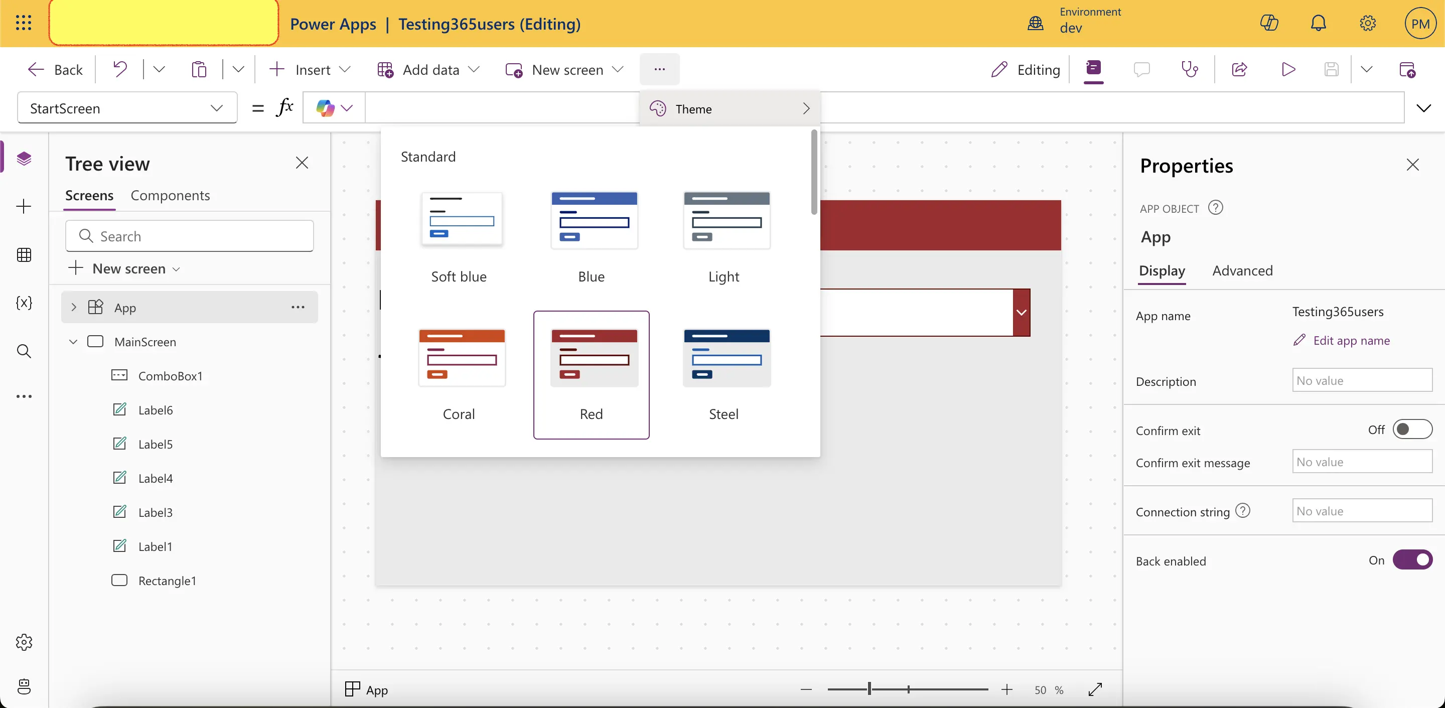
- For a custom theme, manually define colors using the RGBA() function.
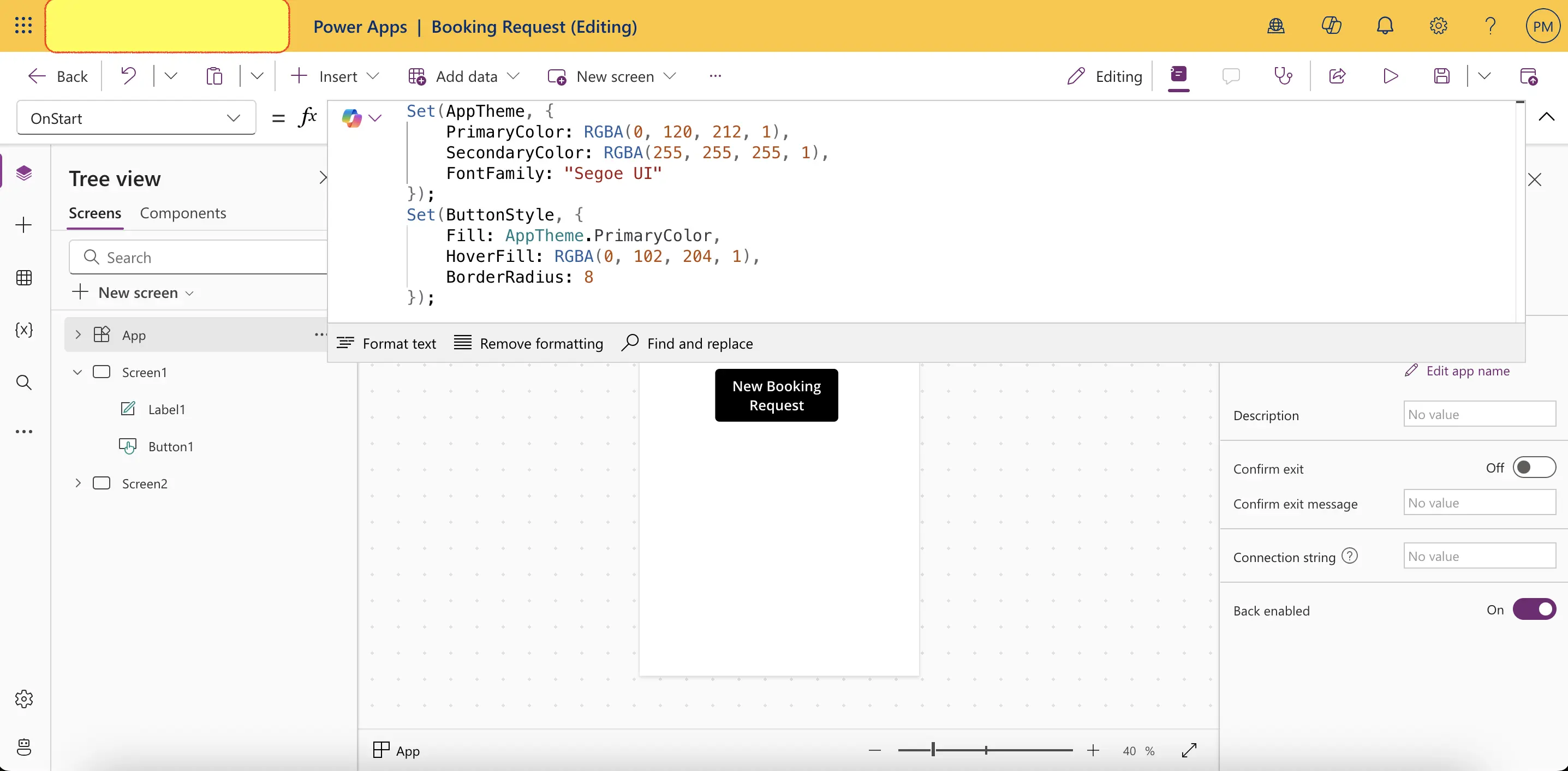
Example: Custom Theme in Power Fx
Set(AppTheme, {
    PrimaryColor: RGBA(0, 120, 212, 1),
    SecondaryColor: RGBA(255, 255, 255, 1),
    FontFamily: "Segoe UI"
})
✅ Ensures a uniform color scheme and typography across screens.
🎭 Branding & Control Customization
Consistency in branding enhances usability and professionalism.
📌 Key UI Customizations:
✔ Set a consistent font & size – Use the same font across all text elements.
✔ Use branded colors – Ensure color schemes align with your organization’s identity.
✔ Modify button styles – Change hover effects and rounded corners for a polished look.
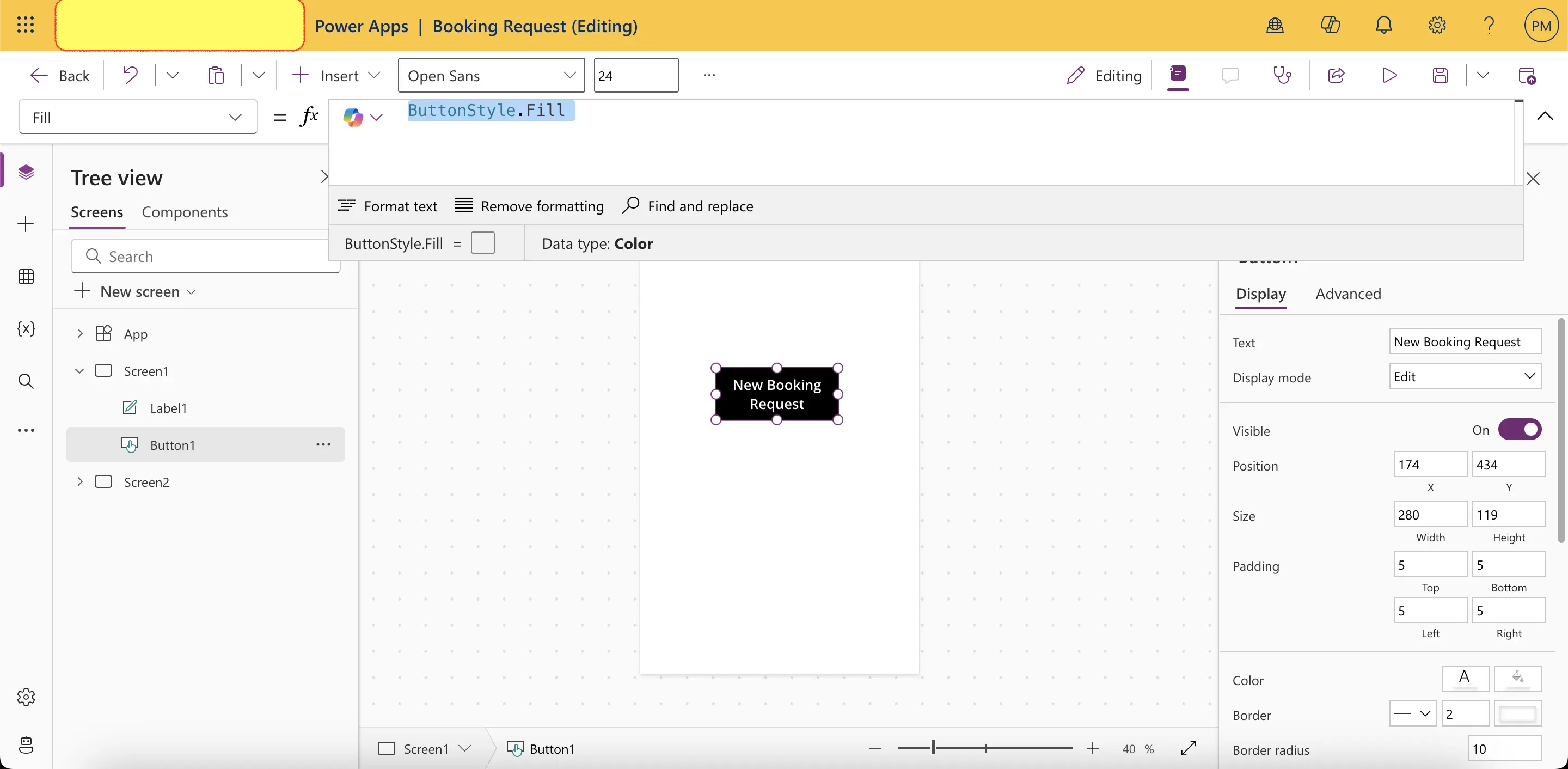
Example: Define a Custom Button Style
Set(ButtonStyle, {
    Fill: AppTheme.PrimaryColor,
    HoverFill: RGBA(0, 102, 204, 1),
    BorderRadius: 8
})
Apply ButtonStyle to Button
ButtonStyle.Fill✅ Creates a professional and visually appealing UI.
🎯 Enhancing UI with Icons & Images
Icons and images improve user interaction and make the app visually engaging.
🖼️ Adding Icons
- Use built-in Power Apps icons from the Insert → Icons menu.
- Customize properties like Size, Color, Hover Effects.
- Use icons for navigation buttons, status indicators, and interactive elements.
Example: Dynamic Icon Color Based on Status
If(Status = "Success", RGBA(0, 200, 0, 1), RGBA(200, 0, 0, 1))✅ Visually indicates success/error states with dynamic colors.
📷 Using Images for UI Enhancement
- Upload images to Media Library (
File → Media → Upload). - Use the Image control to display dynamic visuals.
- Bind images to a data source (e.g., SharePoint, Dataverse).
Example: Display User Profile Image from Dataverse
LookUp(Users, UserID = currentUserID, ProfileImage)✅ Personalizes the UI by dynamically showing user-specific images.
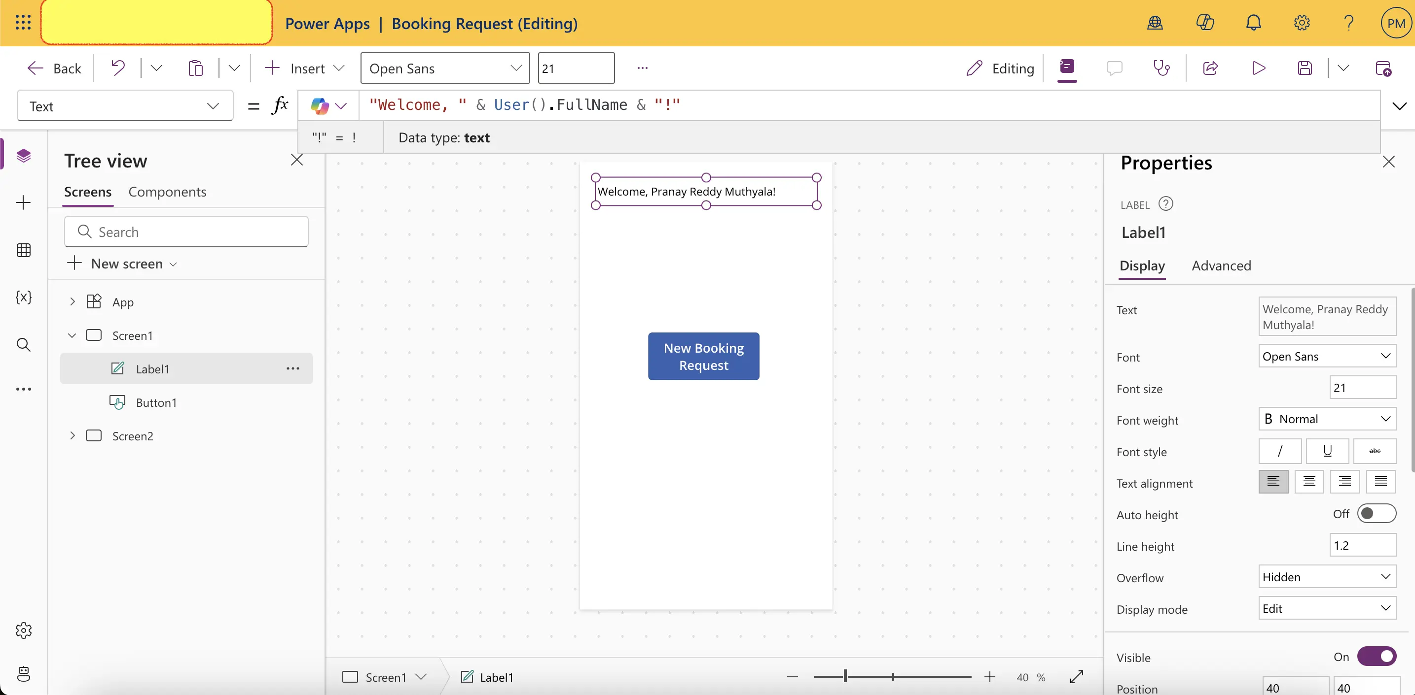
⚙️ Personalizing the App UI
Personalization enhances user engagement by adapting the interface based on preferences.
📝 Common Personalization Features:
✔ Remember user preferences (dark mode, language, layout).
✔ Show personalized greetings (e.g., ‘Welcome, John!’).
✔ Adjust layout based on user roles (admin vs. regular user).
Example: Displaying a Personalized Greeting
"Welcome, " & User().FullName & "!"✅ Creates a more interactive and user-friendly experience.
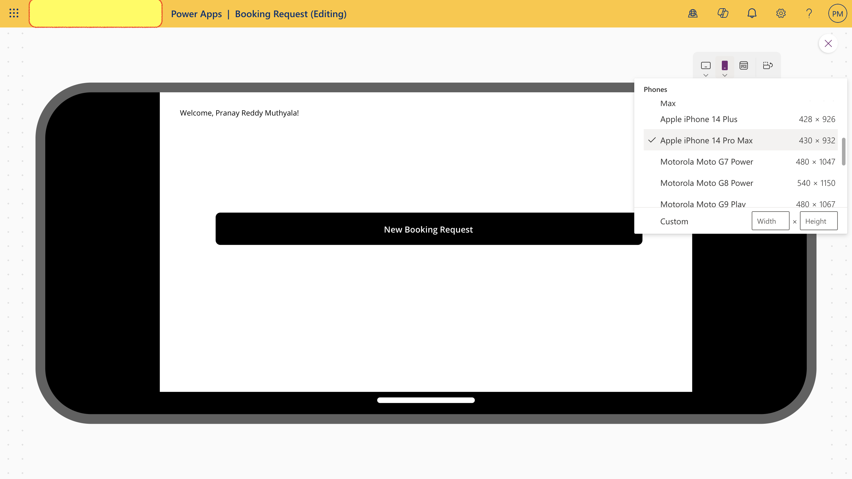
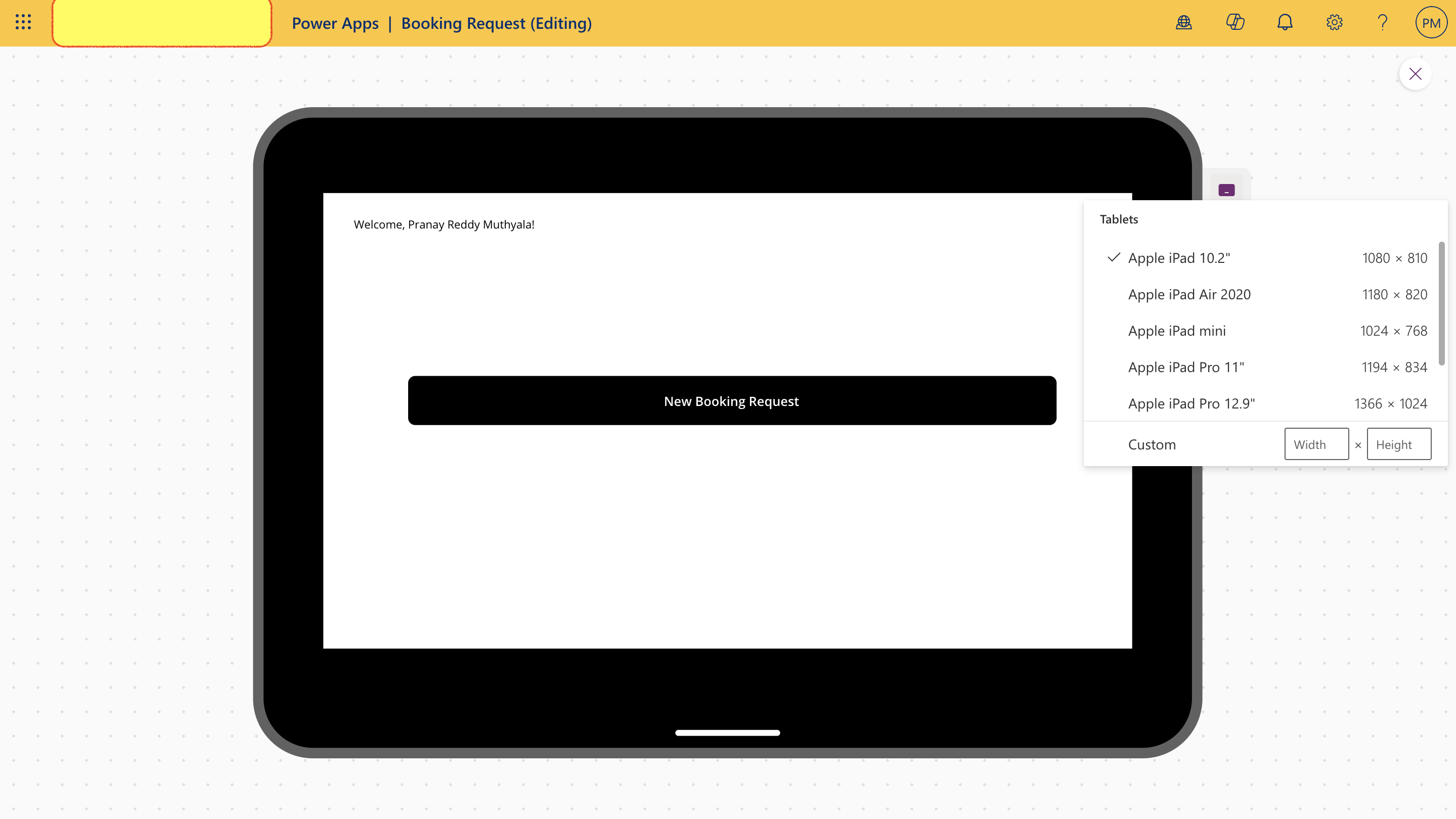
📱 Designing for Tablet & Mobile Form Factors
Apps should be responsive to work seamlessly on different screen sizes.
📌 Best Practices for Responsive Design:
✔ Use relative positioning instead of fixed values.
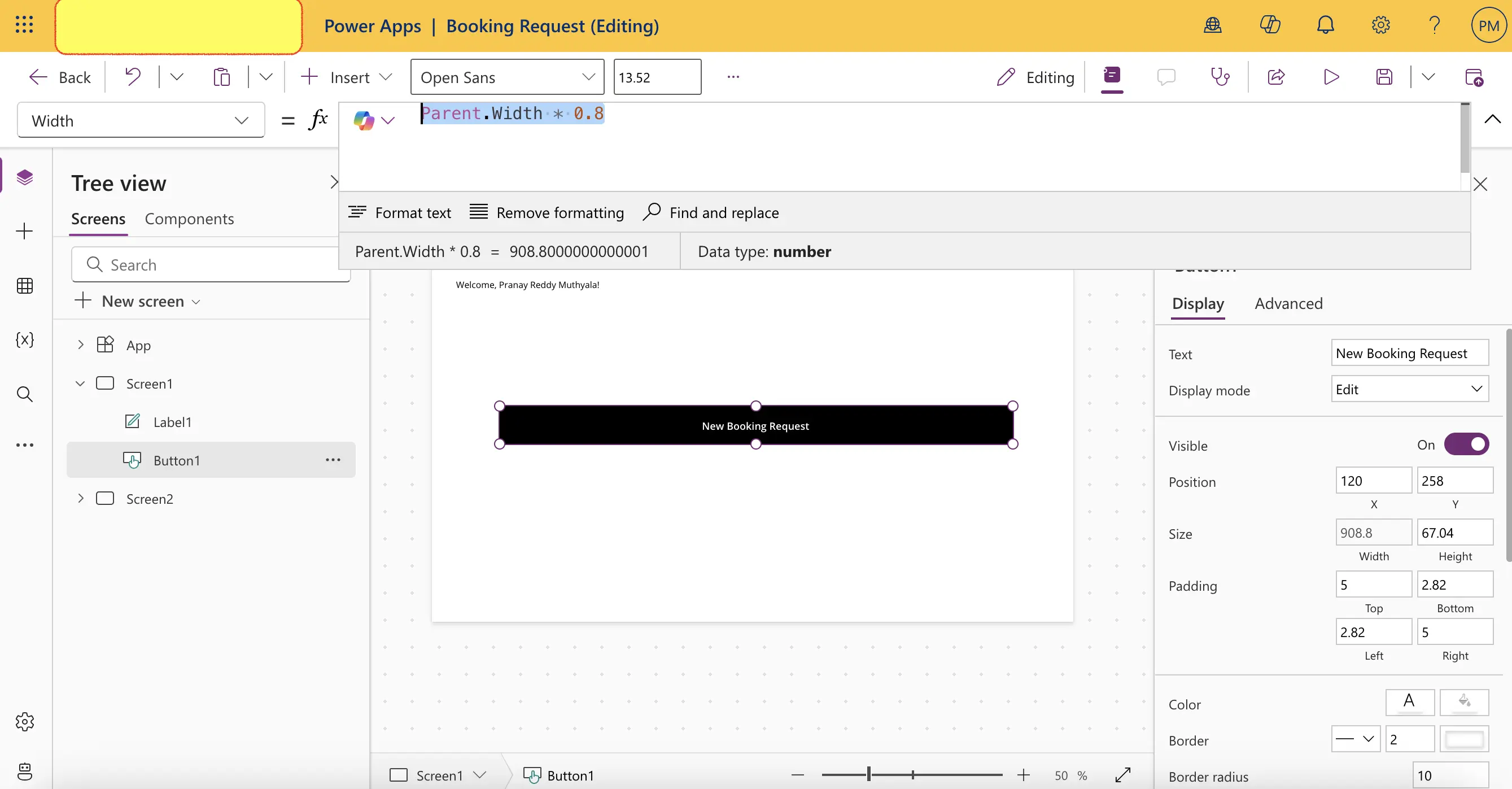
✔ Set controls to scale dynamically using Parent.Width and Parent.Height.
✔ Test on different form factors (tablet vs. phone).
Example: Adjusting Button Size Dynamically
Button.Width = Parent.Width * 0.8✅ Ensures UI elements resize dynamically based on screen size.
🔗 Best Practices for UI Design in Canvas Apps
✅ Keep UI simple & intuitive – Avoid clutter and unnecessary elements.
✅ Use contrasting colors – Ensure text is readable on different backgrounds.
✅ Optimize images & icons – Reduce load time for a smooth experience.
✅ Ensure accessibility – Make apps usable for all users (e.g., screen reader support).
✅ Test, iterate, improve – Gather user feedback and refine the UI.
📢 Final Thoughts
Building an effective UI in a Power Apps Canvas App requires thoughtful design, branding, and responsiveness. By leveraging themes, icons, images, and personalization, you can create a UI that is functional, intuitive, and visually appealing. 🚀
🚀 Stay tuned for more insights! 📜 View My Completion Certificate